I think about colour a great deal. As a designer, colour is a very important part of my design process. As a person, colour is an even more important part of my life, of your life. Colour is embedded in how we describe experience.
1. Colour is already in our language
We experience a lot of things in colour. Have you thought of how many times we use colour to define the moment? Here are a few familiar ones:
- seeing red
- caught red-handed
- red-letter day
- paint the town red
- in the pink
- tickled pink
- feeling blue
- out of the blue
- once in a blue moon
- blue blood
- green around the gills
- the grass is always greener
- green thumb
- give the green light
- golden opportunity
- golden years
- heart of gold
- black sheep
- black mood
- black-and-white thinking
- white lie
- white as a sheet
- waving the white flag
- grey area
- silver lining
- born with a silver spoon
- purple prose
Do we even notice when we’re doing it? We use colour as shorthand for emotion, character, value, danger and even morality. As knitters, whether we are aware of it or not we are always assessing colour. For example, which shade of red is the correct one for your next sweater project? Christmas Red – which can sometimes be confused with Va Va Voom Red, or Vintage Red, something a little quieter and warmer in the Red family?
I picked Christmas red, which may have been a mistake, not because I don’t like the way the sweater is turning out, but because the association is so strong, people seeing the sweater are calling it a Christmas sweater. Not bad, just unexpected.
2. Colour affects how something feels
Think of the emotional associations in things such as golden-hour sunlight, a storm-blackened sky, new spring green, the grey-blue of a rainy day, the brilliant colour after rain, autumn leaves, candlelight, fresh snow, fog, a spectacular sunset, or the almost artificial colours of the northern lights.
And colour can communicate without words: red warning signs and stop lights; green meaning go; fluorescent safety clothing; white bridal clothing in one cultural context; black mourning clothes; school and team colours; national flags.
Have you noticed how the same colour can produce opposite feelings depending on its companions. Red can be romantic, joyful, dangerous, angry, luxurious or cheap. Blue can be peaceful or melancholy. Green can suggest spring and growth—or illness and decay.
We have a personal colour memory. You can walk into a room painted in the same shade of pink as your grandmothers kitchen or see a garment in a faded shade of brown and be reminded of a place or person that your memory has associated with that colour.
Colours that we associate with something, or someone, in memory remain important to us, and the memories can linger for a very long time. Purple was the colour of choice the first time my parents decorated my bedroom for me. Purple curtains, purple drapes, and Oh God! purple flocked wall paper. Purple (click link to check out that bedroom) as a colour was my favourite then and is still my favourite colour now, as one of my very old blog posts can attest.
3. Colour isn’t decoration in knitting
Right now I am working on “The Sunday Series” an intensive class that is examining colour and how it reacts as it is put beside other colours in a garment.
We started with the Sunday Slouch – a gauge swatch hat. That wasn’t its only purpose; it allowed the students to see how well the colours played with each other. It came about because as I was knitting my sweater I realised that my original colours weren’t working. The first 3 inches of colourwork on my sweater were ripped back and I started again with a couple of new colours and some of my original colours, including my main.
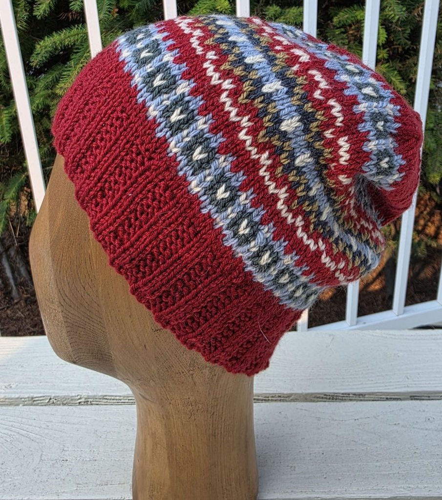
So I designed the Sunday Slouch. A gauge swatch hat that would also allow the students to test out the colours they had selected for their own sweaters. And test them they did.
One student was totally satisfied with her colours. Another only changed one colour, but the others? They had to play a little bit harder to get to where they were happy with their colour choices.
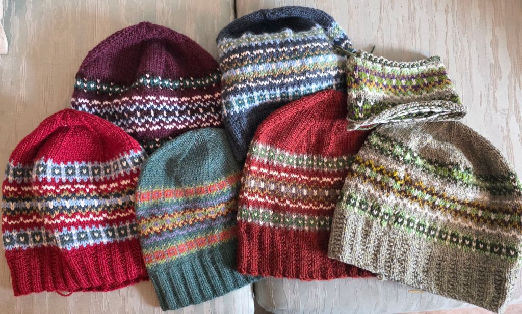
Isn’t this a fabulous collection of colour – and you can see in here two different reds (to continue with the red theme) and how different each hat is – my Christmas Red, cheerful and bright, and then the warmer, more subdued red.
I had AI set up a chart for me with the hats and colours analysed.
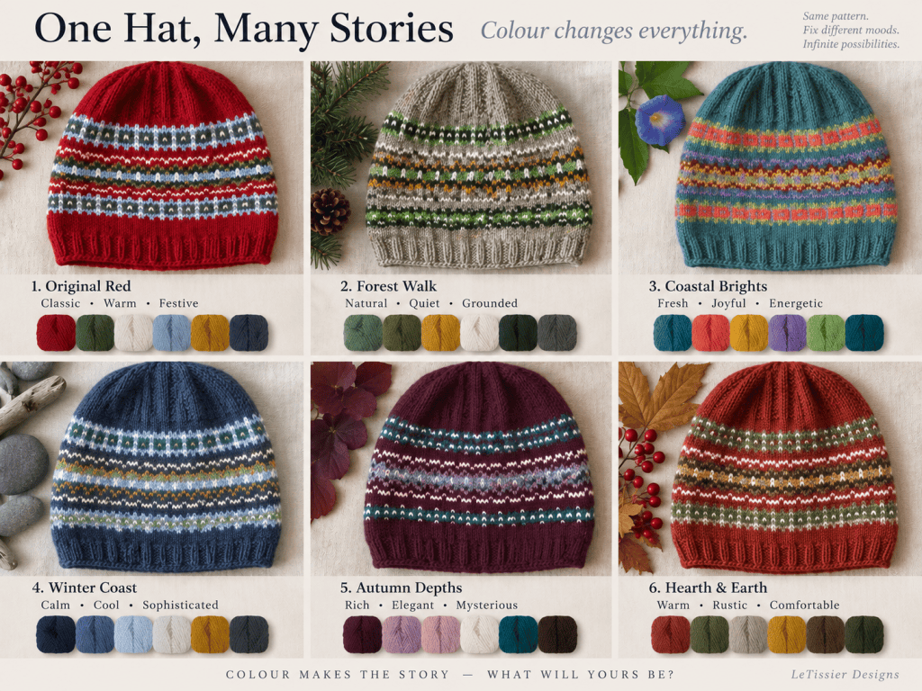
Colour creates the pattern, but it also establishes hierarchy and rhythm. Change which colour dominates and the same chart can look remarkably different. Increase the contrast and it becomes graphic; reduce it and the pattern becomes quieter and more textural.
My students discovered this all firsthand. Everyone chose their original colours carefully, but they still needed to shift/change some colours before they started their sweater! The swatch hat did its job.
Colour also creates proportion. We are all working with six colours. If we used them all equally, except perhaps for striping, it could look chaotic. Used properly, the same six colours – one dominant, two supporting and three appearing as highlights – the knitting takes on a control and a sophistication.
The patterning I am using is borderline chaotic as I have been trying to use the bulk of the patterning colours fairly evenly, but spread throughout the garment. I have kept the background very defined to keep the colours under control. Cheerful is how I am thinking of the effect.
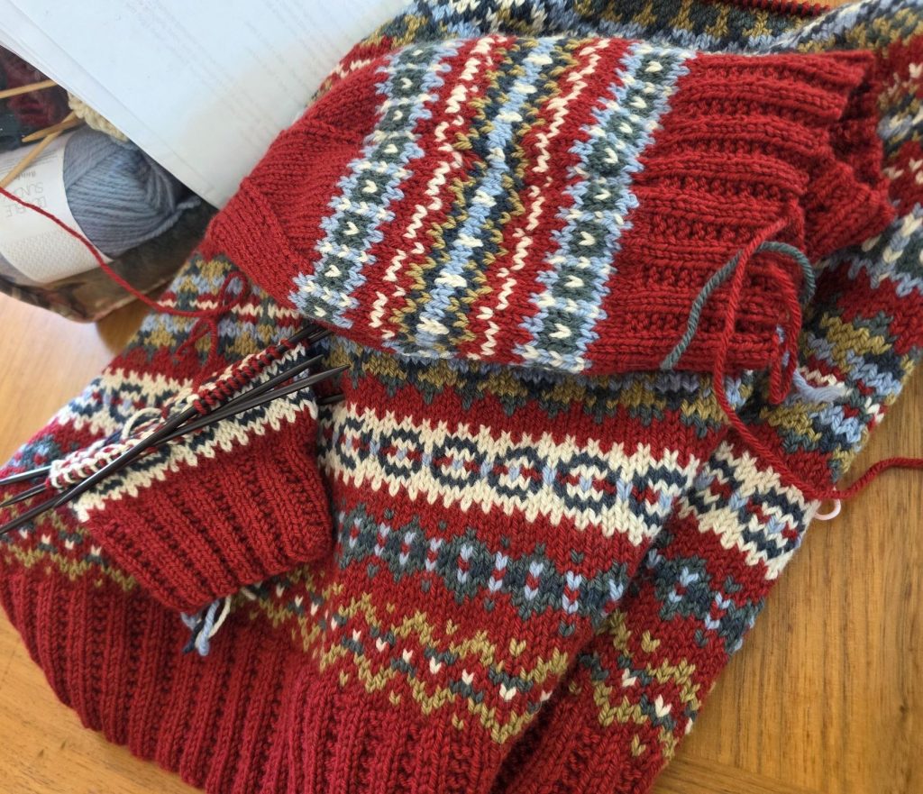
When we talk about colour and colour in our knitting there is the “unexpected” colour. The colour that doesn’t seem to fit at first glance, but becomes the colour that makes the other colours sing together and move naturally in the mix. For my sweater the unexpected colour is the light blue. It is the one colour that was both different and important. Its job in my sweater was to cut down any similarity to Christmas, and change the emotional “feel” of my background colour. It does it for me – though not for everyone. Many still call this my Christmas sweater.
So, for fun, the next time you pick a colour, think about why you chose it.
Happy Knitting
Lynette

